What is CSS Flexbox?
1 Like
Hi Tim,
Flexbox is a CSS method to align and arrange elements conveniently. It permits you to create space that expands as you add content, hence saving you from having to perform addition browser alterations to make your page have room for all the material.
The CSS Flexbox expands to fill the available space, by default in the direction of a single axis (typically either horizontal or vertical) which can be changed.
A Flexbox comprises two elements: a container and an item(s).
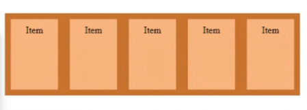
The container is the outermost element, followed by any number of items, which can be laid out horizontally or vertically.
Hope it helps!
3 Likes
Thanks Shahzebh,
That was really helpful!
How different it is from CSS Grid?
2 Likes
CSS grids and CSS Flexbox are similar in the way that they both allow you to create grid layouts. However, the only major difference between them is that CSS Flexbox doesn’t allow you to use its orientation on both axes at once, while CSS grids do.
As mentioned above, CSS grids are stacked in two dimensions, whereas CSS Flexbox works within one dimension. Therefore, if you need a responsive layout that works in both dimensions, it might be a better idea to use CSS grids.
To deep-dive into each of the properties of CSS flexbox, plz go through the following blog:
3 Likes