Device : [Desktop, Windows 11, Edge browser]
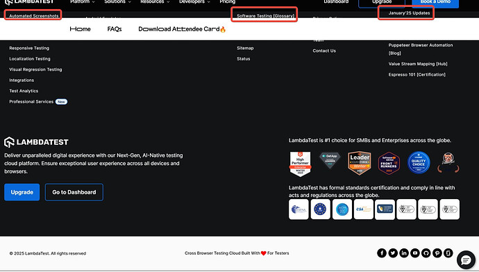
- Footer content overlaps with the menu header when scrolling to the bottom creating a cluttered and unpolished user experience.
Thank you for registering to Testμ Conference 2025 by LambdaTest.
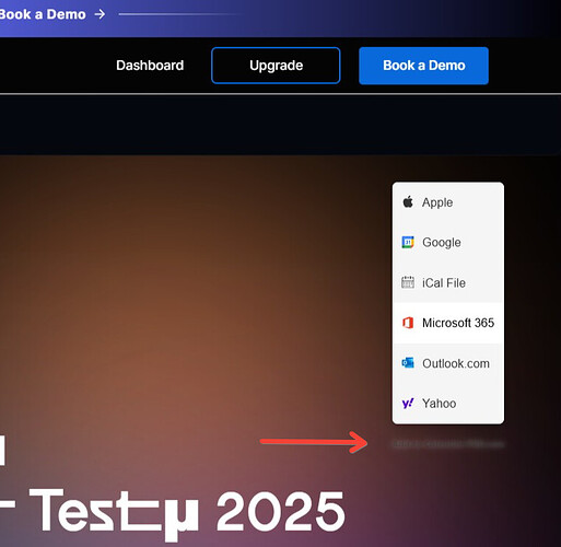
- Content is blurred and not readable properly below the popup.
- Twitter icon is outdated.
Hi @anshabatra2007,
Thank you for taking the time to report these UI issues on the Testμ Conference page! We appreciate your attention to detail and your feedback helps us improve the experience for everyone.
We’ve noted the following issues:
-
Footer overlap – We will investigate this and ensure proper spacing to avoid clutter.
-
Blurred content – We’ll check and fix any rendering issues affecting readability.
-
Twitter icon – Thanks for pointing it out! We’ll update it to the latest branding.
Our team will work on these fixes, and we’ll update you once they’re resolved. If you come across any other issues or have more suggestions, please feel free to share. Thanks again for your valuable feedback!
Regards
Sparsh
1 Like

